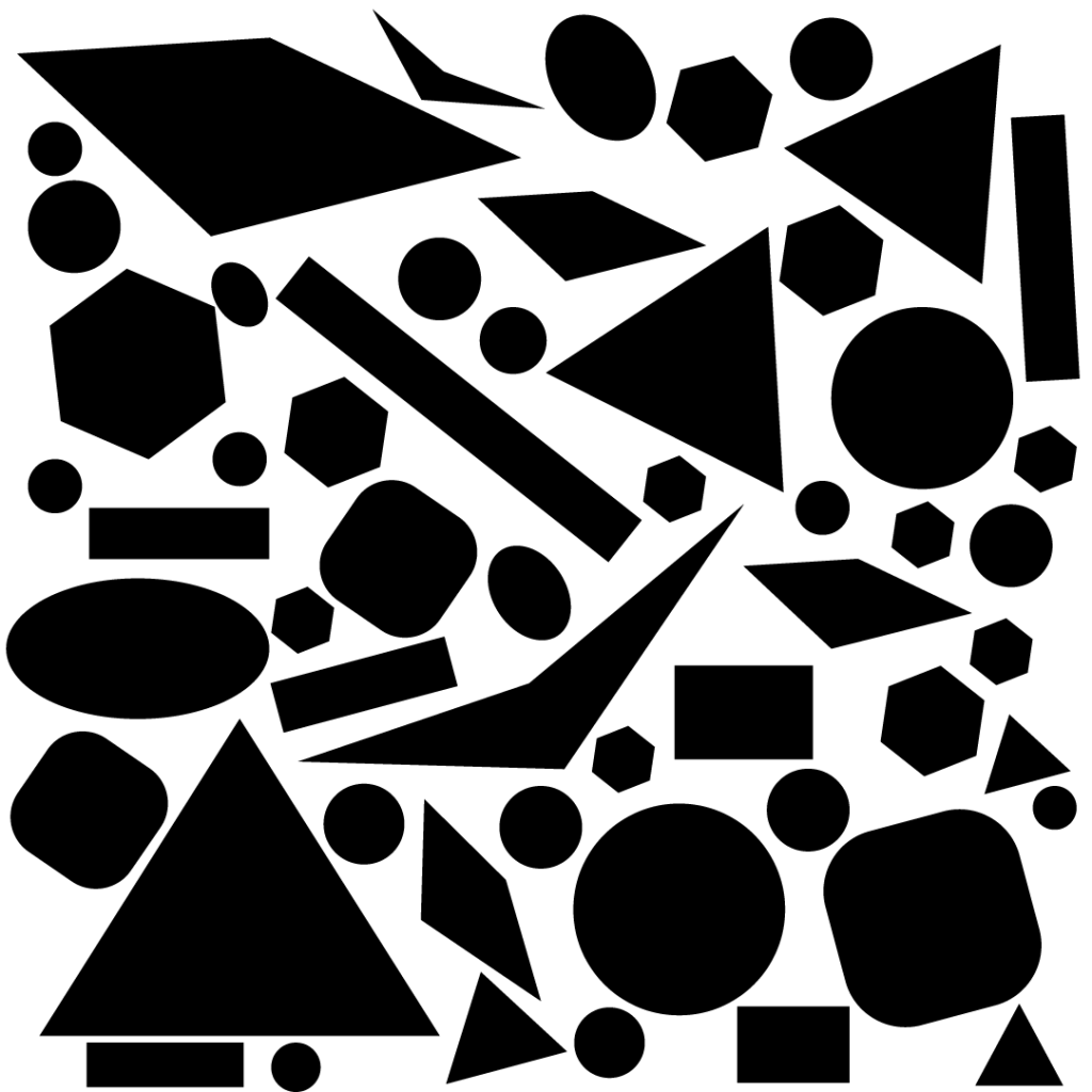
In this lesson task we got an exercise that was linked to the figure/ground-concept in design. Using different black cut-outs on white paper, the goal was to rearrange the various shapes to find the point where the distinction between figure and ground became unclear.
Since I at the time didn’t have access to all of the physical material needed for this task, I did the exercise digitally with shapes in Adobe Illustrator.
To begin with, my experience was that the amount of space occupied by each color (black or white) seemed to be the main factor as to which of the two i interpreted as figure and which I interpreted as ground.


Using squares, I found that the black part had to make up more than half of the scene in order to become ground (background) instead of figure. This may have to do a lot with a bias towards the common practice of adding darker values a the white paper in order to make up the figure in a drawing or a design. When the amount of black exceeded the amount of white, the figure/ground-relationship started becoming unclear.

However, placement and the choice of shapes were also factors that counted a lot to the interpretation.
I found that if the white part of the scene made up a familiar and easily recognizable shape, the distinction became more unclear with less black occupying the scene. For example, when the white space made up the shape of a cross, I started to see the white as figure, even though it made up more than half of the scene.

Adding white star shapes over black, I always perceived the star as figure, no matter how much of the space it occupied.


When a lot of different black shapes were spread randomly all over the page, I perceived them as individual shapes, thus as figure, even though they occupied most of the available space. However, when I got rid of the spacing between the shapes and made them intersect each other, the distinction between figure and ground at once became more unclear.


And at last, I put a black square in the center of the composition. I found that it wasn’t too obvious to me if it acted as figure or ground. My guess is that it blended in as a part of the scene because had the same square shape as the white “frame” around it. I then rotated it 45 degrees, and, to me, the exact same square shape suddenly stood out much more in the composition and became much more distinct as figure. It seemed that the rotation of the shape created more contrast to the white ground/background.


What I learned from this exercise is that there is an endless amount of factors that contribute to how the figure/ground-relationship is perceived. The amount of each value (in this case: black or white) is not on its own what determines what is foreground and what is background. What kind of shapes that are used, the amount, placement and recognizability of the shapes are all factors that that together makes up our interpretation of what is figure and what is ground of an image or a layout.
