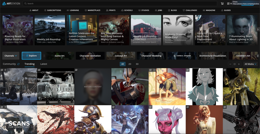
For this lesson task we were going to ask friends or family members to pick a nice-looking website at random for us, which we should analyze in terms of content, design and purpose. For the task, we were given some questions to answer regarding the website.
ARTSTATION
The first website suggestion I got was ArtStation (artstation.com).

1. What type of website we are looking at?
ArtStation is an online platform for artists to share their artwork with others. This could be traditional or digital paintings and drawings, animations, graphics, 3D-models, sculptures and so on. The website also offers online courses and assets for different art-related software.
2. Which industry is this website in?
ArtStation is a social media platform that is based in the visual art industry.
3. What is its purpose?
I would say that the main purpose of the website is to create a community for artists, where they can showcase their portfolios and communicate with each other in an easy way. It also works as a platform for hiring artists and to find work as a freelancer.
4. Which different types of content are used?
The main content of the website is the user’s uploaded images and videos.
5. How is the content presented?
The user generated content is laid out in a crowded grid system that makes images fill up most of the screen in a gallery view (both on the landing page, on search and on the portfolio sites). I found that this way of presenting the content is commonly used on other similar websites as well. I also found the dark theme of the website to be trendy among websites of this kind.
NINTENDO
The next suggestion I got was Nintendo’s website (nintendo.co.uk).

1. What type of website we are looking at?
Nintendo is a Japanese video game company. Their website acts mainly as an online store.
2. Which industry is this website in?
The website belongs in the video game industry.
3. What is its purpose?
The main purpose of the website is to sell and inform about video games that the company offers.
4. Which different types of content are used?
The website uses a great amount of images, icons and bright colors. The landing page shows a gallery view of images with accompanying text that makes up a mix of articles, news, links to products etc.
5. How is the content presented?
A heavy amount of images and icons is used to present their content, which makes the website seemingly crowded with information. This makes for a fun, eye-catching visual style that suits the company well, and is also commonly used among similar-themed websites.
